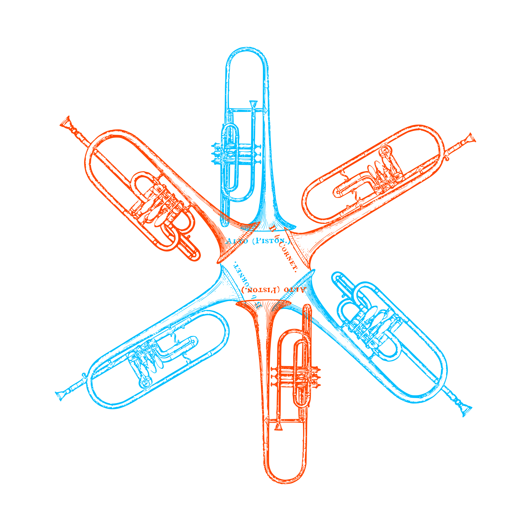
A Constantly Plotting orchestration
If you followed the Guardian's music section about ten years ago, you might have run into a small series of articles called Hey What's That Sound?
The articles focused on the weird and the wonderful in instrument choices.
As a geek for unusual instrumentation (and a dataviz geek), I wanted to see what a data-driven approach can add to the topic.
Spotify has a great visualisation showing emoji appearing in playlists.
Which made me think perhaps we can use a similar technique to identify instersting song-instrument associations.
The technique I'm using is TFIDF. Normally it's used for text analysis or search result rankings.
But in this case I wanted to see whether it can help us find which instruments appear on which songs.
The process looks roughly like this.
Firstly, we get a bunch of Spotify playlists that have "banjo" in the title or description.

Not all songs are going to be banjo songs in these playlists, so we want to see which songs appear across multiple playlists.
We can say these songs are likely to be more banjo than others.
But that's not the full story.
A lot of songs will feature more than one instrument. Searching for them across playlists will give results across other instrument searches.
Something ranking high in a "banjo" playlist, might also rank high in a "flute" playlist.
Which is why we want to compare a few instrument groups to see whether songs are more "banjo" or more "flute".
To do this, we look at which songs appear across the different playlist groups.
Those that are more generic get ranked lower.
Which, in the case of my project here, leaves us with the cream of the crop for each instrument.
(Of course, that's a huuuuge simplification of both TFIDF and my process, but check the notes below if you want more info.)
It's worth pointing out that this is an exercise in relative collective wisdom.
Which means that what I assume are playlists featuring specific instruments, might to other people be playlists of songs they want to play on those instruments.
Or mistake for that instrument.
Or associate with that instrument.
Having said that, the approach works quite well in general. But bear in mind that this is educated computer guesswork, rather than a manual, methodical categorisation of each song.
So, having hammered Spotify's api (thanks Spotify, and sorry), I've got in the region of 200 thousand distinct songs, 28 thousand individual playlists, covering 57 thousand different artists.
Which gives us nice summaries of 48 separate instruments hand-picked by yours truly.
The cool thing about this is that Spotify also provide a set of measures for each song.
For example, it can tell us whether a song is good for dancing, whether it's high energy and whether it's currently popular on Spotify.
So, if we take an instrument and look at how those measures spread out, we can start getting a sense of how the instrument influences the music it appears on.
To do this, I've taken each instrument and visualised how songs spread on a particular measure.
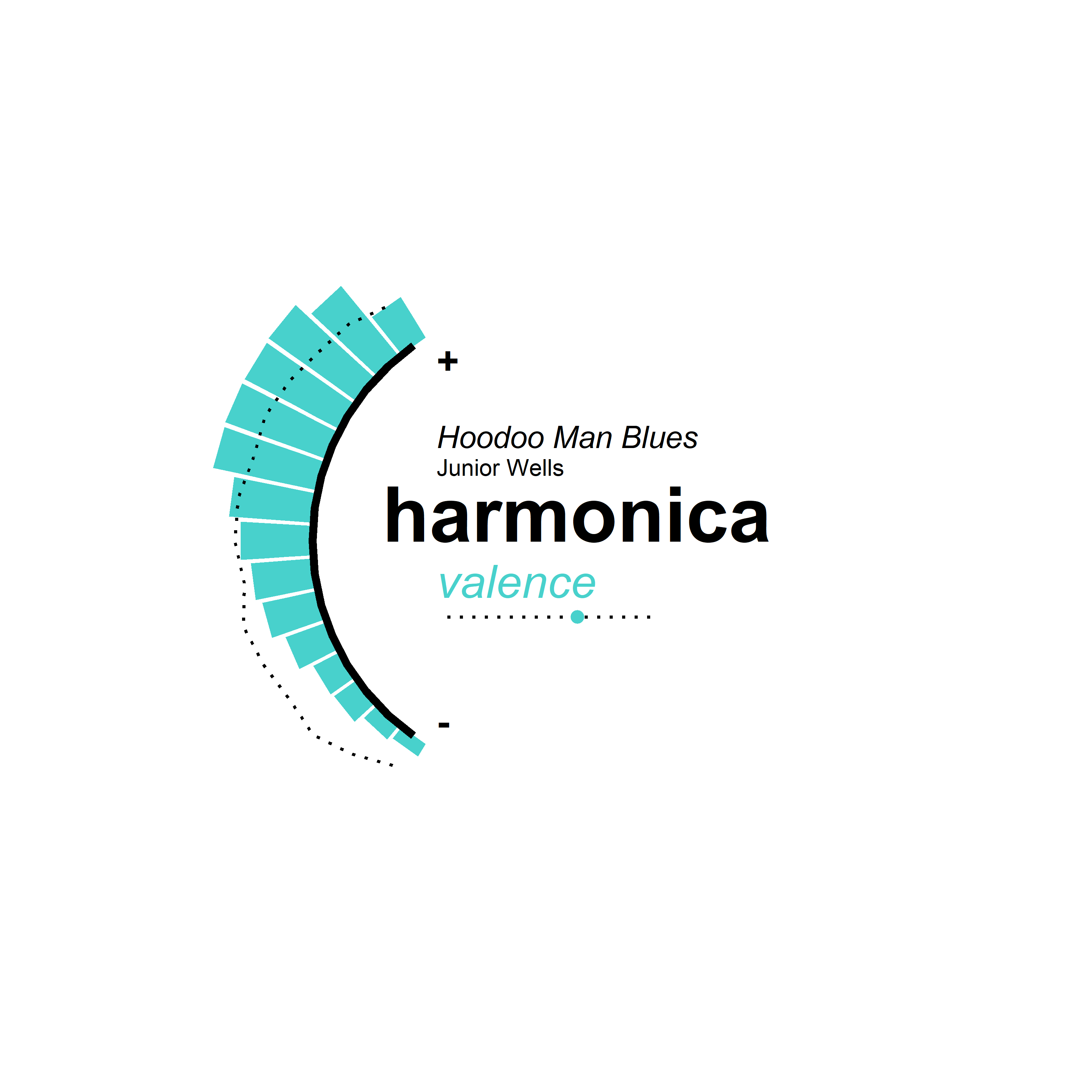
Let's take all songs that appear in harmonica playlists and look at how happy those songs are.
Spotify measures perceived happiness of a song with a metric called valence, which it describes as:
...the musical positiveness conveyed by a track. Tracks with high valence sound more positive (e.g. happy, cheerful, euphoric), while tracks with low valence sound more negative (e.g. sad, depressed, angry).
The bars radiating out to the left show the number of songs grouped by their valence scores.
Harmonica tracks score pretty highly.
Which is cool, because we might associate harmonicas with sad bluesy prison situations (I blame the movies), but looking at this we can say harmonica music is actually fairly upbeat.
The overlaid dotted line shows the spread of valence for all other instruments. Most songs in this sample are fairly equally spread out, so we can say that compared to other instruments, harmonica songs do tend to be more cheerful.
The upper part of the chart shows a sample harmonica track that gets a typical valence score, in this case Hoodoo Blues by Junior Wells. With a 6.4 valence score, this puts it very much in line with the overall average for harmonica.
In comparison, here's an example of a high-valence song.
And at the opposite end of the scale is the fairly nostalgic Fruta Boa by jazz harmonica virtuoso Toots Thielemans. Have a quick listen to each and you should be able to see what I mean.
You can also see the average acousticness for the instrument in the plot below the instrument name.
So how do other instruments do in comparison?
See for yourself.
How about another measure?
Let's see how instruments compare on energy, which Spotify defines as:
... a perceptual measure of intensity and activity. Typically, energetic tracks feel fast, loud, and noisy. For example, death metal has high energy, while a Bach prelude scores low on the scale. Perceptual features contributing to this attribute include dynamic range, perceived loudness, timbre, onset rate, and general entropy.
In case you're wondering, this is what a death growl is.
But if we, for example, wanted to make the ultimate turntable playlist?
What would it sound like?
And if you want to listen to that sampler turntable playlists, you can find it on Spotify.
You can also see all of the instrument vizzes in the Flickr album here.
We've seen what overall instrument profiles look like. But what I really want to get to now is a way of listening to all of these tracks.
And being particular about my music I want to have something that can help me get that high-energy 70s electric piano playlist just right.
Queue the Sound-a-rator.
Here's a quick tour of how to use it.
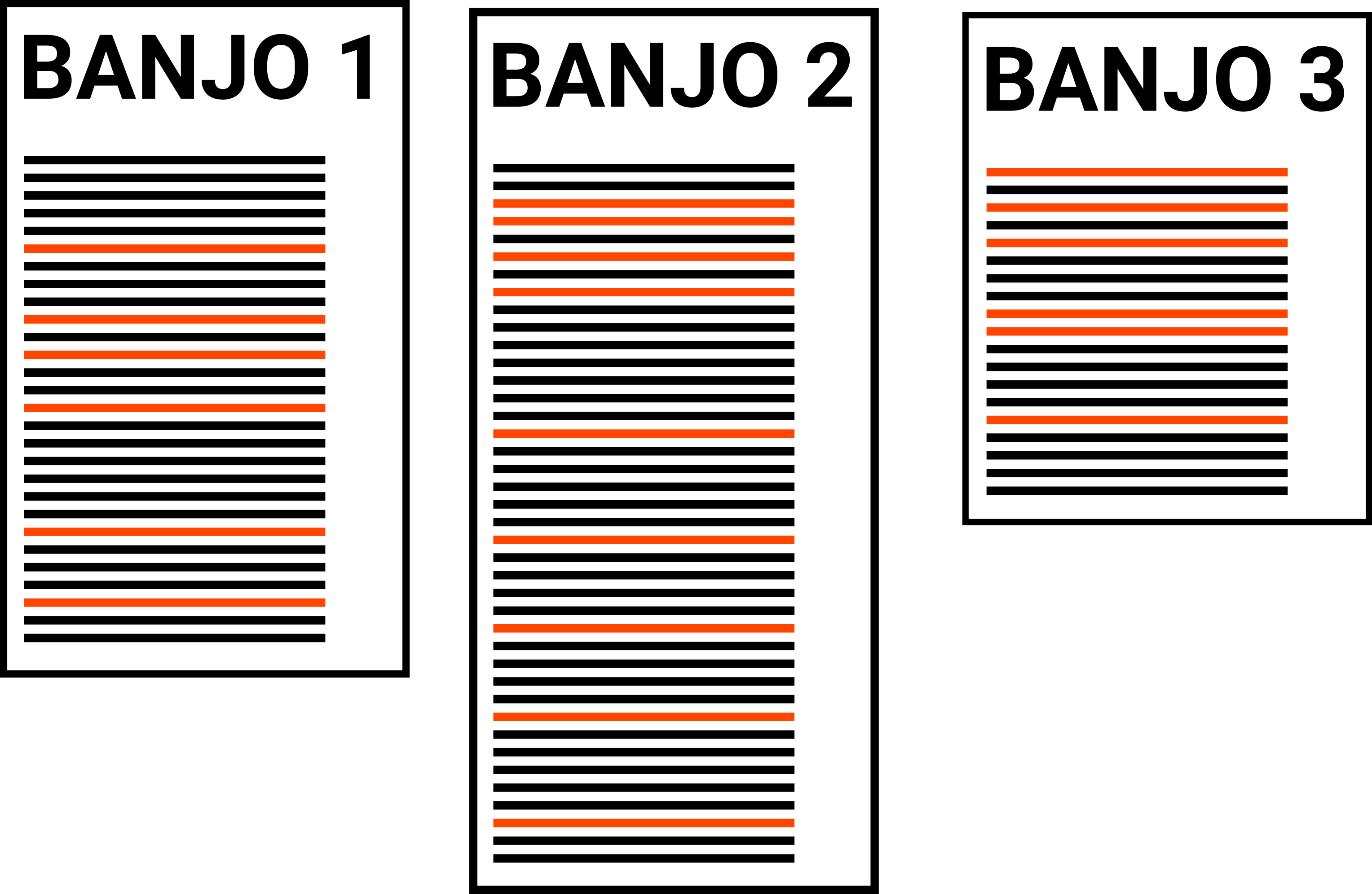
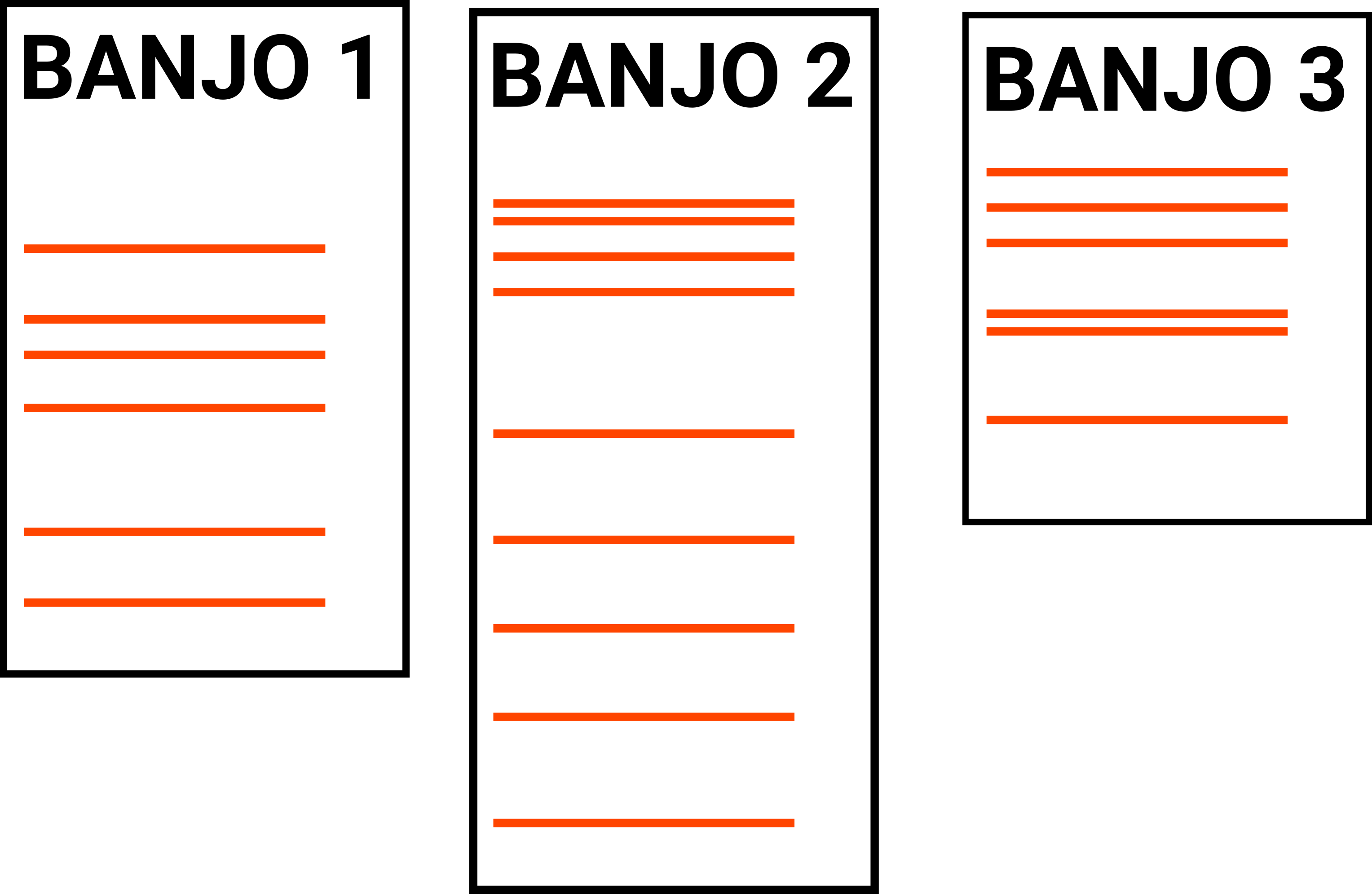
The dashboard gives you a quick overview of a particular instrument and highlights key songs associated with it.
On the right, you've got top songs ranked by how important a song is to the overall dataset (see Part 1 for details).
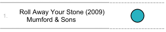
The bubbles next to the song indicate how sure the ratings system is that you'll find a specific instrument in a particular song.
For example, looking at banjo, the system is pretty sure that Roll Away Your Stone by Mumford & Sons has a banjo on it.
However, it's less sure about Earl's Breakdown by Earl & Scruggs.
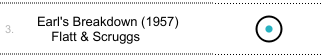
Remember, this doesn't mean the song doesn't feature a banjo. We're just less certain that there's a banjo on there.
On the right, you can use the filters to fine-tune what you're looking for.
You can use the top slider to filter and search for other instruments.
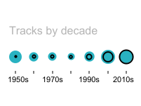
Below that, you can get a rough sense of the overall trend for the banjo by decade.
You can also look at and filter specific measures (from Part 2).
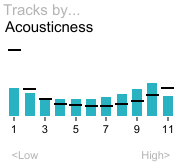
These graphs are similar to basic histograms. But they're also a bit better, because the scale goes up to 11.
Additionally you can get a quick sense of the number of tracks per genre for each instrument.
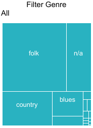
Unsurpisingly, for banjo, most songs are folk.
Finally, in the text in this column, you might find highlights. These will let you filter to specific areas of interest, like 80s banjo in this case .
Below are some of my hand-picked favourites from looking at the data.
In terms of simplicity, it's rock music's answer to the triangle.
And in line with that SNL sketch, peak cowbell seems to have hit in the 70s where it was a key rock feature.
Of course, it goes without saying Don’t Fear the Reaper makes it onto that list.
Also, make sure you check out Jungle by ELO, which is a treat when it comes to covering weird sounds.
This one caught me off guard but there’s a lot of flute in rap. Apparently it’s a thing.
Mostly of the flutes in rap seem to be samples.
Check out A Tribe Called Quest's Keep it Rollin' cool subtle flute loop coupled with a bit of electric piano.
Stick with the flute and you'll find some amazing tracks. I highly recommend exploring what funk has to offer .
With it's distinctly opulent and elaborate sound, the use of the harpsichord in rock and pop often feels... well a bit comical.
But it's almost a universal 60s rite of passage.
Check out The Kinks clever use on Two Sisters or the great pairing with a strong drumbeat on Millennium's Prelude.
There also seems to have been a resurgence in usage in the 90s with Tori Amos leading the charge.
Another 60s staple instrument, the sitar gained unsurprising popularity due to it's patronage by The Beatles .
But it seems have gained an insteresting life in electro-jazz, with acts like Thievery Corporation , Nicola Conte and Thunderball .
Also, don't miss Ananda Shankar's awesome work, including a spectacular version of Jumpin' Jack Flash.
Few instruments evoke a state of mind as distinctly as the steel drum.
So it's amazing to see how musicians in the past couple decades have managed to break with that distinct association and use the instrument to connote something other than island cool.
Check out M.I.A's Bingo, the dark and moody Underwaterfall by Bearcubs and Heart it Races by Architecture in Helsinki .
There's a lot more in there.
Brass tracks which manage to span the Balkans, New Orleans and Bavaria. Youngblood Brass Band are something else.
Synth tracks from the 70s (before it became a big thing) feature some awesome work.
Anything that comes up under electric piano .
And then, there's throat singing ,the theremin , balalaikas and much more, so feel free to play around here or on Tableau Public.
While this covers a lot, it's been great fun working with this dataset and I definitley want to cover a few topics that didn't make the final cut here. So keep an eye on posts from the blog for more.
And if you've managed to do some interesting digital crate-digging, feel free to drop me a line.
Data from Spotify's Web API and validated against tags in the Last.fm API.
Data gathering and processing done in R using Tidyverse, jsonlite, HTTR, a modified version of RSpotify and the awesome Tidytext package.
The instrument scoring system is based on TFIDF scores for each search group, combined with Last.fm tag ranks and weighted by several factors to produce a combined score.
Genre definitions done using a similar method (but applied at artist level). Classical music filtered out (sorry classical music).
Visualisation of instrument metrics done using ggplot2 and dashboard designed using Tableau Public.
Dashboard scroll triggering done using Waypoints.
Keep an eye on github for the R code behind the analysis and visualisation.