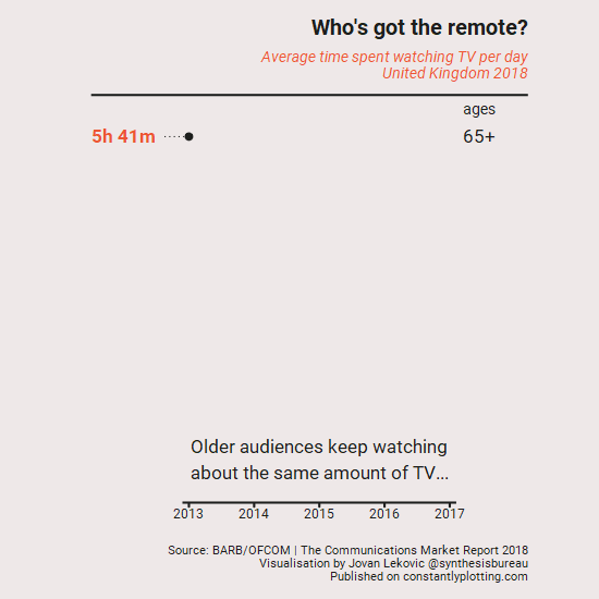
The amount of time people spend watching TV is changing rapidly. And that’s especially true for younger people. This quick visualisation shows how stark the difference between younger and older people really is.
It’s worth adding that this doesn’t fully capture the many new ways we watch TV (and to be fair, it’s not an easy task capturing this data). But it certainly highlights how the relationship with TV is changing.
Here’s a quote from OFCOM on that difference between younger and older TV viewers:
Over-54s make up 28% of the UK population of the UK but accounted for 51% of television viewing in 2017.
The Communication Markets report 2018
Data from the OFCOM Communication Markets report 2018 (see their full report here). It’s great to see they’ve started publishing data in a machine-readable format.
Visualisation made in R: data transformation and plotting done using the Tidyverse package, animation done using gganimate.
You can find a copy of the code used to make this plot over here.